Individuals and businesses are continually inundated with information. Whether you’re leading a company, managing a project, or seeking to make well-informed decisions, data is your ultimate ally. However, raw data alone won’t suffice. To truly decipher the data’s meaning, you require two indispensable tools: reports and visualization. This blog post delves deep into the pivotal role of reports and visualization in data analysis and demonstrates how these elements can unlock invaluable insights.
The Significance of Reports
Reports serve as the cornerstone of any data analysis endeavor. They possess the unique ability to convert raw data into organized, comprehensible, and actionable information. Here’s why reports are indispensable:
a. Data Organization: Reports structure data in a logical, accessible format, providing context and meaning.
b. Accessibility: Reports democratize data, making it accessible to a broader audience, including non-experts.
c. Empowering Decision-Making: Reports empower you to make informed decisions by offering insights and identifying trends that guide your choices for your business, project, or personal life.
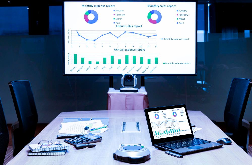
The Power of Visualization
While reports structure data, visualization transforms it into an engaging visual representation. Here’s why visualization is crucial:
a. Instant Comprehension: Visual elements, such as charts and graphs, facilitate quick and intuitive understanding of complex data.
b. Pattern Identification: Visualization highlights trends, outliers, and correlations that might be obscured in raw data, aiding in the discovery of opportunities and challenges.
c. Effective Communication: Visuals are captivating and memorable, making them a potent tool for conveying data-driven insights to others.
The Perfect Symbiosis: Reports and Visualization
Reports and visualization are not standalone entities; they are most potent when combined. Consider the following advantages of using them in harmony:
a. Holistic Understanding: Reports offer in-depth explanations, while visualizations provide a quick overview. Together, they provide a comprehensive grasp of your data.
b. Tailored Solutions: Customize your reports and visualizations to align with your specific needs and preferences, be it pie charts, bar graphs, or tables.
c. Real-Time Insights: Employ the right approach to generate real-time reports and visualizations, ensuring that you stay updated with your data analysis.
In Conclusion
In the realm of data analysis, the synergy between reports and visualization is irrefutable. Reports lay the structured foundation, delivering clarity and context to raw data, enhancing accessibility, and fostering informed decision-making. Visualization, on the other hand, breathes life into data by crafting engaging and informative visuals that unveil patterns and insights with immediacy.
Now, envision having the support of an AI-driven assistant like ReportQL by your side. With its SQL-based capabilities, it streamlines report creation, enabling you to effortlessly generate real-time reports and dashboards while drawing data from a multitude of apps and databases. ReportQL not only simplifies the complexities of data preparation but also empowers businesses to maximize the potential of their data.
The fusion of reports and visualization, complemented by advanced tools like ReportQL, paves the way for data-driven triumph. Say goodbye to the complexities, and welcome the future of data reporting with ReportQL. For the latest updates and in-depth insights about ReportQL, we invite you to join our vibrant Discord community.
Unlock the Full Power of Data Insights!